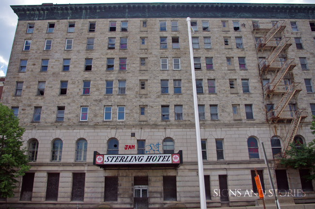
As scheduled, demolition of the Hotel Sterling in Wilkes-Barre began on Thursday. Here are my pictures from a month ago from this great old place: Destruction and Rebirth
Wandering About, One Day at a Time
As scheduled, demolition of the Hotel Sterling in Wilkes-Barre began on Thursday. Here are my pictures from a month ago from this great old place: Destruction and Rebirth
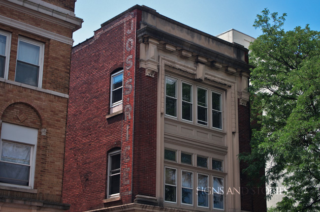
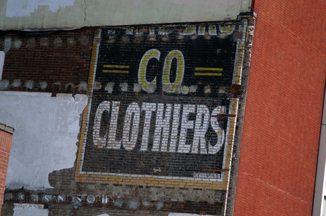
The Joseph S. Rice Building
I’ll give my friend Denise the credit for finding this one. She spotted this one first and was so happy she found this ghost that she bounced up and down for a few minutes.
So who was Joseph S. Rice? I found this in a history of Wilkes-Barre, written in the twenties:
From the time he was nine years of age Joseph S. Rice has been making his own way in life, and the more than a half century of independent activity which has been his has brought achievements in varied lines. Not many successful business men are the possessors of world records in a field entirely outside the general business world, but Mr. Rice held the world championship as a long distance bicycle rider back in 1896, and for some years he was also a long distance roller skater. He is engaged in business at No. 138 South Main Street, Wilkes-Barre, Pennsylvania, as a designer and manufacturer of lighting fixtures, and is also the owner of a prosperous and highly attractive gift shop, located at the same address, and has associated with him in business his wife and his son, J. Granville Rice.
OK. Thoroughly cool. Glad there’s still a memory of you around, Mr. Rice.
Everyone moved on ahead as I tried to get some good angles on this one. I’m positive Denise didn’t notice that I managed to fit her into the next shot:
That’s her, at the bottom right. And how could I avoid taking a shot of this sign? Missing letters are just plain fun. It’s undeniable.
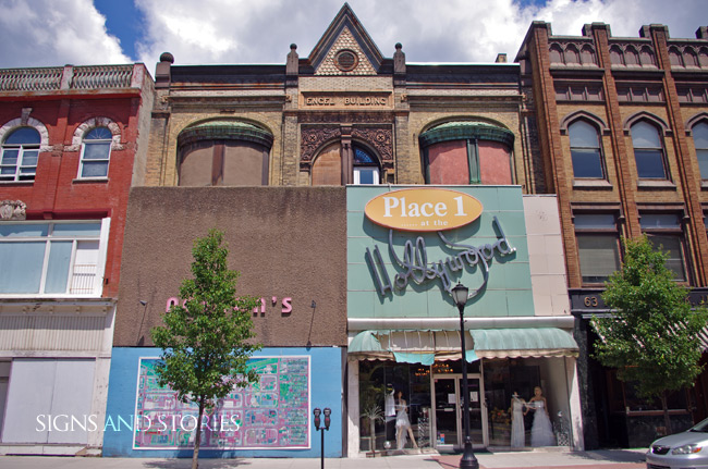
One of the odder buildings I’ve seen. The top looks like it’s part of another building.
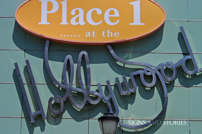
The Hollywood portion of this sign, I’m guessing, has been around awhile. The only information I could get on this business was that it was owned by Irving and Shirley Bellsey for a number of years, and that WNEP weather girl Ann Wideman worked here modeling clothing. The “Place 1 …… at the” part is fascinatingly awful. Place 1 has another store in Scranton, so I’m guessing whenever they bought this place out from the previous owners, that part of the sign was added, perhaps to cover up something.
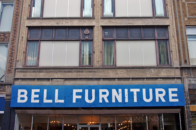
I didn’t really think this was that great until I processed it. Neon bullet holes, striking blue against a dull brown building. It’s kind of growing on me. Also cool that Bell’s Furniture has been around since 1960.
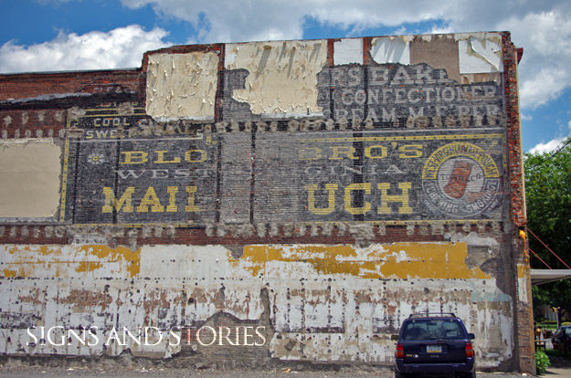
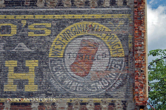
Another unveiling! This ghost just made an appearance on the side of Boscov’s. Can’t quite make it all out, but welcome back, stranger!
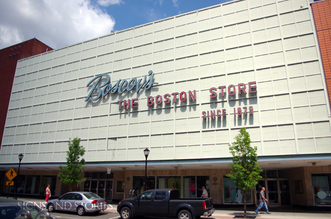
I recently saw a conceptual drawing of a department store that was planned in the late 30s, and when I saw the façade of this Boscov’s/The Boston Store, I felt compelled to take a picture of it that looked very much like that drawing. I was very happy with the result. Even the people walking seemed to fit in with the vibe of that concept.
Originally, this was called Fowler, Dick and Walker: The Boston Store. Frank Jump has some interesting stuff on his blog about it.
So, I’ll throw this question open to the class: is it pronounces Wilkes-Barry, or Wilkes-Bear? Ask anyone within a 75-mile radius of the place, and you get a 50-50 split. I was told by a girl I went to high school with, who was from the city in question, that it was Wilkes-Barry. But I’ve heard commercials on the radio and TV on the local stations who utilize Wilkes-Bear. Personally, I don’t like Wilkes-Bear. But then, I also say creek instead of crick.
Anyway.
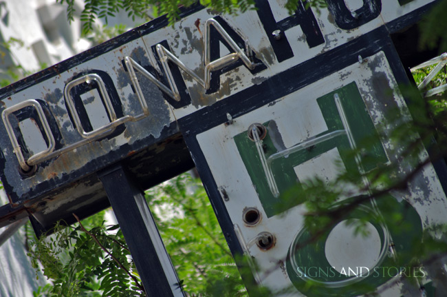
Every once in a while, I run into a sign that I had researched previously, but wasn’t looking for at the time. While driving down Main Street in Wilkes-Barre (as part of the excursion that brought us to the Sterling), we spot something in the trees. Laura sees it a second before I do, and I don’t get a real good look, but neon was close, I could smell it. We pull off and take a look:
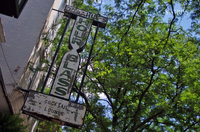
One of the things that I focus in on when taking pictures of signs is the amount of interference. Are the surroundings distracting? When I parked myself underneath the trees and started shooting, I was very concerned that I wouldn’t get the results I had hoped for. In the shot above, taken with the whole sign, I find it too busy. But then, I hauled out the long lens and got some close-ups, and here, I think the shadows and greenery enhance:
Later, when I started reviewing the pictures on the big screen, one of my favorite things happened. Very often, I catch something in a picture I’ve taken that I didn’t notice when I was standing there. Look at the shot below:
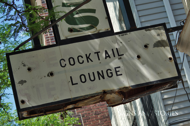
At the time, I noticed that the bottom part of the sign had been redone, in an impossibly sloppy manner. But then I noticed the dear old neon bullet holes, and I started to think, they don’t match. This sign didn’t say Cocktail Lounge originally. And then I saw the faint outlines of what would have been behind the neon, and then it made sense. The top line reads SEA FOOD, and the second line reads STEAKS – CHOPS.
So Donahue’s had been a restaurant, prior to its conversion to a “Cocktail Lounge.” I love finding out stuff like that.
More from Main Street in the next post.
Our friends Denise and Lynn have been trying to get us to Wilkes-Barre for at least a year to see the Sterling Hotel, an abandoned building on the Susquehanna that was one of the more opulent places of its day. We got a chance to visit at the beginning of June, and out we went to the city to see it. The sign, of course, is not much to see, but even in these passing glances you can see the magnificence of it.
In the course of taking these shots I noticed another guy with a point-and-shoot working around the building from the other side. We met in the middle, both of us shaking our heads at how much the place had gone to seed.
“They’re tearing it down end of July,” he said. “Too far gone to save.”
I re-doubled my effort to get shots. Last chance at this old beauty.
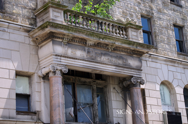
You know there’s a problem when there’s a tree growing on your hotel…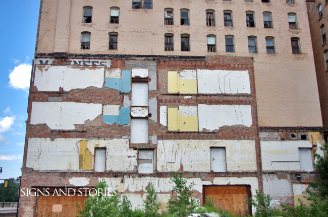
Lynn talked to the guy a bit more, told him about what I do. He said he was from Plymouth, which I knew of because I had gotten some shots there last year. “They knocked down an old building across from Fainberg’s,” he said, and my ears perked up. Fainberg’s was the furniture store I went to visit; their neon sign was straight out of the thirties, it appeared. “The building was from 1896, and when they tore it down they uncovered an old tobacco sign from 1892.”
Well, I thought, guess we’re going back to Plymouth.
So, sure enough, as we drove along US 11, we came upon an empty lot, and at the far end, we saw this:
Mail Pouch Alert!
So often, I’m talking about the bad side of the story, like the Sterling: a sign or a building that no one seems to have use for and is deemed “beyond saving.” But this one seemed like a win for history’s sake. Glad to see you again, old man. It’s been a long time…
On a side note, last year Laura and I had taken the road less traveled to Pottsville because I had read about a Mail Pouch sign on the side of a tavern. Look below and you’ll see why I couldn’t resist. But also, note the similarity of the signs. Same artist?
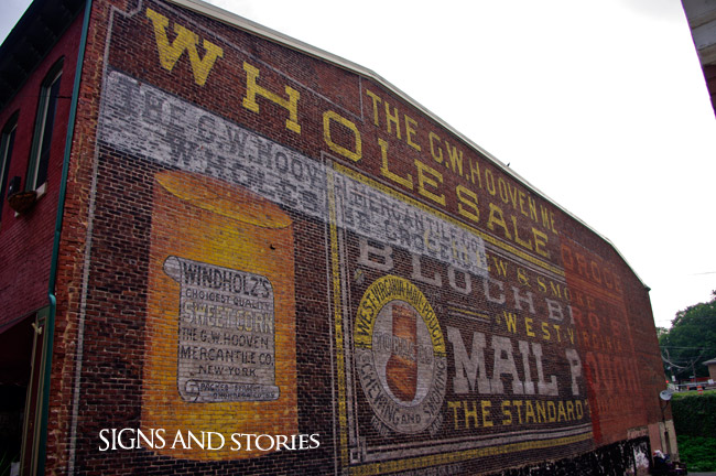
G. W. Hooven Mercantile, Pottsville, PA